BootStrap3 弹出的 模态框垂直居中问题(手机弹出层)
- 15605
- HTML
- 10
- super_dodo
- 2015/07/15
在网页开发中,包括手机开发中,手机弹出层的,Bootstrap被广泛的使用,Bootstrap的模态框是很出色的一个组件,能够及时的提示用户,友好的UI和编辑的操作方便用户使用。同时在手机展示页面也能很好的兼容。正常情况下模态框是比较靠近页面的头部,看了一下css 里面有padding-top:30px这个样式。所以正常情况下模态框是距离头部30px.
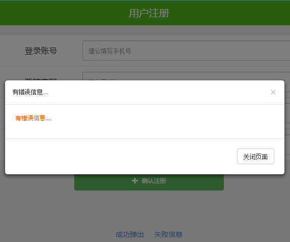
手机和电脑端的弹出层垂直居中会使页面交互更美观,下面就是Bootstrap3模态框垂直居中的核心代码,主要检测页面的高度,从而实现打开的模态框垂直居中显示。有了这个方法,稍加改动,也可实现头部显示,底部显示等。
直接上核心的代码
//模态框居中的控制
function centerModals(){
	$('.modal').each(function(i){   //遍历每一个模态框
		var $clone = $(this).clone().css('display', 'block').appendTo('body');
		var top = Math.round(($clone.height() - $clone.find('.modal-content').height()) / 2);
		top = top > 0 ? top : 0;
		$clone.remove();
		$(this).find('.modal-content').css("margin-top", top-30);  //修正原先已经有的30个像素
	});
}
$('.modal').on('show.bs.modal', centerModals);		//当模态框出现的时候
$(window).on('resize', centerModals);				//当窗口大小变化的时候
DEMO的示例代码
<!DOCTYPE HTML>
<html lang="en-US">
<head>
<meta charset="UTF-8">
<meta name="viewport" content="width=device-width, initial-scale=1.0, maximum-scale=1.0, user-scalable=0">
<title>BootStrap3 弹出的 模态框垂直居中问题(手机弹出层)</title>
<link rel="stylesheet" href="../css/bootstrap.css">
<link rel="stylesheet" href="../css/reset.css">
<link rel="stylesheet" href="../css/common.css">
<script type="text/javascript" src="../js/jquery-1.7.2.js" ></script>
<script type="text/javascript" src="../js/bootstrap.min.js"></script>
</head>
<body>
<!--引入头部 -->
<div id="headerWrap">
<div class="headerWrap">
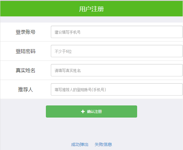
<h3>用户注册</h3>
</div>
</div>
<div class="mainWrap">
<form action="" method="post" id="post_form">
<table class="post_table" id="post_table">
<tbody>
<tr>
<td>登录账号</td>
<td><input type="text" name="Form[name]" value="" placeholder="建议填写手机号" class="form-control"></td>
</tr>
<tr>
<td>登陆密码</td>
<td><input type="password" name="Form[name]" value="" placeholder="不少于6位" class="form-control"></td>
</tr>
<tr>
<td>真实姓名</td>
<td><input type="text" name="Form[name]" value="" placeholder="请填写真实姓名" class="form-control"></td>
</tr>
<tr>
<td>推荐人</td>
<td><input type="text" name="Form[remark]" value="" placeholder="填写推荐人的登陆账号(手机号)" class="form-control"></td>
</tr>
</tbody>
</table>
<div class="aui_btn" >
<a id="addBtn" class="btn btn-success"><i class="glyphicon glyphicon-plus"></i> 确认注册</a>
</div>
</form>
<div class="clear"></div>
</div>
<div class="readMe">
<a id="okAlert" href="javascript:void(0)">成功弹出</a>
<a id="errAlert" href="javascript:void(0)">失败信息</a>
</div>
<!--成功之后的弹出提示框-->
<div class="modal fade myModal" id="myModal" tabindex="-1" role="dialog" aria-labelledby="myLargeModalLabel" aria-hidden="true">
<div class="modal-dialog modal-lg">
<div class="modal-content">
<div class="modal-header">
<button type="button" class="close" data-dismiss="modal" aria-label="Close"><span aria-hidden="true">×</span></button>
<h4 class="modal-title">恭喜您,注册成功</h4>
</div>
<div class="modal-body">
<p>恭喜您,注册成功.</p>
</div>
<div class="modal-footer">
<button type="button" class="btn btn-default" data-dismiss="modal">关闭页面</button>
</div>
</div>
</div>
</div>
<!--成功之后的弹出提示框-->
<div class="modal fade myModal" id="myModal2" tabindex="-1" role="dialog" aria-labelledby="myLargeModalLabel" aria-hidden="true">
<div class="modal-dialog modal-sm">
<div class="modal-content">
<div class="modal-header">
<button type="button" class="close" data-dismiss="modal" aria-label="Close"><span aria-hidden="true">×</span></button>
<h4 class="modal-title">有错误信息...</h4>
</div>
<div class="modal-body">
<p style="color:#ff5800">有错误信息....</p>
</div>
<div class="modal-footer">
<button type="button" class="btn btn-default" data-dismiss="modal">关闭页面</button>
</div>
</div>
</div>
</div>
<script type="text/javascript">
$("#okAlert").click(function() { ////弹出成功的提示信息
$('#myModal').modal('show');
});
$("#errAlert").click(function() { //弹出失败的提示信息
$('#myModal2').modal('show');
});
//当关闭动态提示框的时候跳转网页
$('#myModal').on('hidden.bs.modal', function (e) {
$('#myModal2').modal('show'); //弹出成功的提示信息
return false;
});
//模态框居中的控制
function centerModals(){
$('.modal').each(function(i){
var $clone = $(this).clone().css('display', 'block').appendTo('body');
var top = Math.round(($clone.height() - $clone.find('.modal-content').height()) / 2);
top = top > 0 ? top : 0;
$clone.remove();
$(this).find('.modal-content').css("margin-top", top-30);
});
}
$('.modal').on('show.bs.modal', centerModals); //当模态框出现的时候
$(window).on('resize', centerModals); //当窗口大小变化的时候
</script>
</body>
</html>
手机网页中也需要对用户的一些操作做弹出信息,所以简洁的使用BootStrap是非常不错的一个方案。开发者开发过程中也很便捷。Bootstrap还有很多好的功能等待各位去体验。
手机端的弹出层,弹出页面,弹出效果,请尽情使用Bootstrap,电脑端也是。
欲望与能力的差距越小,人越快乐,内心越安稳。


相关阅读
- 通过Google API客户端访问Google Play帐户报告PHP库
- PHP执行文件的压缩和解压缩方法
- 消息中间件MQ与RabbitMQ面试题
- 如何搭建一个拖垮公司的技术架构?
- Yii2中ElasticSearch的使用示例
热门文章
- 通过Google API客户端访问Google Play帐户报告PHP库
- PHP执行文件的压缩和解压缩方法
- 消息中间件MQ与RabbitMQ面试题
- 如何搭建一个拖垮公司的技术架构?
- Yii2中ElasticSearch的使用示例
最新文章
- 通过Google API客户端访问Google Play帐户报告PHP库
- PHP执行文件的压缩和解压缩方法
- 消息中间件MQ与RabbitMQ面试题
- 如何搭建一个拖垮公司的技术架构?
- Yii2中ElasticSearch的使用示例


