首页自适应的分类图标的动画渐入效果
- 4988
- HTML
- 0
- super_dodo
- 2015/10/28
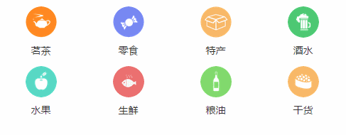
随着HTML5技术的不断更新和革新,动画效果也越来越多的被使用。下面分享一个很炫的,自适应的分类的效果展示。
该展示不需要借助js或者jquery,单纯的html5+css3实现,有两种方式:渐入和震荡的进入。进入的类型分为左右,各位请根据需要自定义修改即可。
展示效果图如下:
点击进入展示下载页面
HTML部分的代码如下:
<!doctype html>
<html lang="en">
<head>
	<meta charset="UTF-8">
	<meta name="viewport" content="initial-scale=1.0, maximum-scale=1.0, user-scalable=0">
	<title>首页自适应的分类图标的动画渐入效果</title>
	<link rel="stylesheet" href="homeCateIcon.css" type="text/css">
</head>
<body>
	<div id="homeCateIcon">
		<div class="homeCateIcon" style="width:100%;">
			<a href="" class="item"><div class="icon fadeInLeft cateIcon1"></div>茗茶</a>
			<a href="" class="item"><div class="icon bounceInLeft cateIcon2"></div>零食</a>
			<a href="" class="item"><div class="icon bounceInLeft cateIcon3"></div>特产</a>
			<a href="" class="item"><div class="icon fadeInLeft cateIcon4"></div>酒水</a>
			<a href="" class="item"><div class="icon fadeInLeft cateIcon5"></div>水果</a>
			<a href="" class="item"><div class="icon fadeInLeft cateIcon6"></div>生鲜</a>
			<a href="" class="item"><div class="icon fadeInLeft cateIcon7"></div>粮油</a>
			<a href="" class="item"><div class="icon fadeInLeft cateIcon8"></div>干货</a>
		</div>
	</div>
</body>
</html>
CSS部分的代码如下:
* {margin: 0;padding: 0;outline: 0}
a {text-decoration: none;}
body {
	font-family: Microsoft YaHei;
	font-size: 14px;
	-webkit-touch-callout: none;
	-webkit-user-select: none;
	background-color: #f0f0f0
}

@-webkit-keyframes fadeInLeft {
	0% {
		opacity: 0;
		-webkit-transform: translate3d(-300%, 0, 0);
		transform: translate3d(-300%, 0, 0);
	}
	100% {
		opacity: 1;
		-webkit-transform: none;
		transform: none;
	}
}
 @keyframes fadeInLeft {
	0% {
		opacity: 0;
		-webkit-transform: translate3d(-300%, 0, 0);
		transform: translate3d(-300%, 0, 0);
	}
	100% {
		opacity: 1;
		-webkit-transform: none;
		transform: none;
	}
}

@-webkit-keyframes fadeInRight {
	0% {
		opacity: 0;
		-webkit-transform: translate3d(300%, 0, 0);
		transform: translate3d(300%, 0, 0);
	}
	100% {
		opacity: 1;
		-webkit-transform: none;
		transform: none;
	}
}
@keyframes fadeInRight {
	0% {
		opacity: 0;
		-webkit-transform: translate3d(300%, 0, 0);
		transform: translate3d(300%, 0, 0);
	}
	100% {
		opacity: 1;
		-webkit-transform: none;
		transform: none;
	}
}

@-webkit-keyframes bounceInLeft {
	0%, 60%, 75%, 90%, 100% {
		-webkit-animation-timing-function: cubic-bezier(0.215, 0.610, 0.355, 1.000);
		animation-timing-function: cubic-bezier(0.215, 0.610, 0.355, 1.000);
	}
	0% {
		opacity: 0;
		-webkit-transform: translate3d(-3000px, 0, 0);
		transform: translate3d(-3000px, 0, 0);
	}
	60% {
		opacity: 1;
		-webkit-transform: translate3d(25px, 0, 0);
		transform: translate3d(25px, 0, 0);
	}
	75% {
		-webkit-transform: translate3d(-10px, 0, 0);
		transform: translate3d(-10px, 0, 0);
	}
	90% {
		-webkit-transform: translate3d(5px, 0, 0);
		transform: translate3d(5px, 0, 0);
	}
	100% {
		-webkit-transform: none;
		transform: none;
	}
}


#homeCateIcon {
	text-align: center;
	padding: 0 0 3px;
	background-color: #fff;
	height: 193px;
}

#homeCateIcon .item {
	width: 25%;
	padding: 13px 0 0;
	display: block;
	float: left;
	color: #333;
	position: relative;
	box-sizing: border-box;
	-webkit-box-sizing: border-box
}
#homeCateIcon .item .icon {
	border-radius: 22px;
	-webkit-border-radius: 22px;
	width: 44px;
	height: 44px;
	margin: 0 auto 8px;
	color: #333;
	position: relative;
	background-size: 44px 44px;
}

#homeCateIcon .homeCateIcon .bounceInLeft {
	-webkit-animation-name: bounceInLeft;
	animation-name: bounceInLeft;
	-webkit-animation-duration: 0.5s;
	animation-duration: 0.5s;
	-webkit-animation-fill-mode: both;
	animation-fill-mode: both;
}
#homeCateIcon .homeCateIcon .bounceInRight {
	-webkit-animation-name: bounceInRight;
	animation-name: bounceInRight;
	-webkit-animation-duration: 0.5s;
	animation-duration: 0.5s;
	-webkit-animation-fill-mode: both;
	animation-fill-mode: both;
}
#homeCateIcon .homeCateIcon .fadeInLeft {
	-webkit-animation-name: fadeInLeft;
	animation-name: fadeInLeft;
	-webkit-animation-duration: 0.5s;
	animation-duration: 0.5s;
	-webkit-animation-fill-mode: both;
	animation-fill-mode: both;
}
#homeCateIcon .homeCateIcon .fadeInRight {
	-webkit-animation-name: fadeInRight;
	animation-name: fadeInRight;
	-webkit-animation-duration: 0.5s;
	animation-duration: 0.5s;
	-webkit-animation-fill-mode: both;
	animation-fill-mode: both;
}

.cateIcon1 {
	-webkit-animation-delay: 0s;
	animation-delay: 0s;
	background:url('./img/1.png') no-repeat;
}
.cateIcon2 {
	-webkit-animation-delay: 0.5s;
	animation-delay: 0.5s;
	background:url('./img/2.png') no-repeat;
}
.cateIcon3 {
	-webkit-animation-delay: 1s;
	animation-delay: 1s;
	background:url('./img/3.png') no-repeat;
}
.cateIcon4 {
	-webkit-animation-delay: 1.5s;
	animation-delay: 1.5s;
	background:url('./img/4.png') no-repeat;
}
.cateIcon5 {
	-webkit-animation-delay: 2s;
	animation-delay: 2s;
	background:url('./img/5.png') no-repeat;
}
.cateIcon6 {
	-webkit-animation-delay: 2.5s;
	animation-delay: 2.5s;
	background:url('./img/6.png') no-repeat;
}
.cateIcon7 {
	-webkit-animation-delay: 3s;
	animation-delay: 3s;
	background:url('./img/7.png') no-repeat;
}
.cateIcon8 {
	-webkit-animation-delay: 3.5s;
	animation-delay: 3.5s;
	background:url('./img/8.png') no-repeat;
}
坚持做一件事情,你就会累积更多知识、更多经验、更多资源,最后也就更有可能成功。想赢,一定要跑得比别人久.


相关阅读
- 通过Google API客户端访问Google Play帐户报告PHP库
- PHP执行文件的压缩和解压缩方法
- 消息中间件MQ与RabbitMQ面试题
- 如何搭建一个拖垮公司的技术架构?
- Yii2中ElasticSearch的使用示例
热门文章
- 通过Google API客户端访问Google Play帐户报告PHP库
- PHP执行文件的压缩和解压缩方法
- 消息中间件MQ与RabbitMQ面试题
- 如何搭建一个拖垮公司的技术架构?
- Yii2中ElasticSearch的使用示例
最新文章
- 通过Google API客户端访问Google Play帐户报告PHP库
- PHP执行文件的压缩和解压缩方法
- 消息中间件MQ与RabbitMQ面试题
- 如何搭建一个拖垮公司的技术架构?
- Yii2中ElasticSearch的使用示例


